Saturday, January 14, 2012
the value of a lightbox
This is a lightbox. Basically it's a 2 foot square box with three translucent sides and a neutral colored backdrop inside. Two bright lights on tripods were included with mine, as well as a small camera tripod and a carrying case. If you sell online, you need to get one of these! I'll show you why.
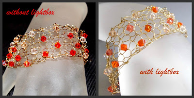
The first picture was taken using my camera's pop up flash, the second was taken using the lightbox and one of the included lights for side lighting. The second photo is evenly lit, the first one is not. As a shopper I would be more attracted to the second photo. Not convinced?
Here's another example. Again, the first photo was taken using the popup flash and the second was taken using the lightbox and one side light.
Using a lightbox will give your product photographs consistency. I received mine for Christmas, and before I got it I took pictures on sunny days by a large window. It was awkward and the lighting wasn't consistent. Sometimes I had to use incandescent (traditional inside lighting) lighting because the outside light wasn't suitable.Sometimes I ended up with color casts because of the light - things would look too blue or yellow, for example.
Here's a link for an inexpensive lightbox on Amazon that will provide everything you need to get started. It's only $31!
Once you have your lightbox, follow the instructions to set it up. Mine was super easy - I pulled the sides up and out and velcroed the back and one of the sides together. Mine came with a double sided background, and for my shots I used the gray side. (The other side of mine is bright blue.) Then place your item inside the tent and set up the lights.
I recommend setting your product up before the lights, so you can easily position the lights to be most flattering on your product. As I mentioned, I used just one light for the "after" shots above, positioned on the outside of the tent, slightly behind the bracelet. Sometimes I use both lights, one on the left and behind, the other on the right and either beside the item or slightly in front of it. I've also used one on on the side and one on top, as shown in the top photo at the beginning of this post. The top of my light box is translucent, so I just placed one light on top and aimed it down towards my bracelet.
This is one of the easiest ways to give your product consistent, professional, look and feel.
What about you? Have you tried a lightbox? What were your results?
Subscribe to:
Post Comments (Atom)


No comments:
Post a Comment